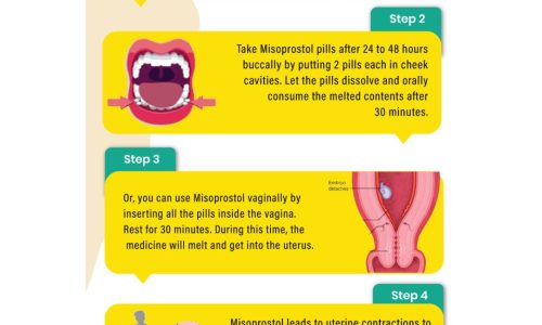
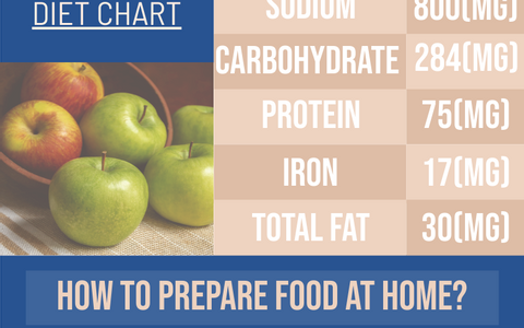
This infographic does a great job of providing information that is useful while visually catering to the reader. The statistics illustrated in this piece are staggering and disheartening but it’s important that they be shared for increased awareness among drivers. Readers are much more apt to digest this information given the way it is being presented. The use of color and contrast, bolded and highlighted words and numbers will really stand out to them. Facts that might have otherwise been overlooked if they were printed in black and white are now more received because they’re being creatively delivered. It’s important to use a variety of different methods to share information since not everyone learns the same way. This infographic is a great way to spread awareness to people who learn visually. This infographic is a double feature because it gives plenty of information but also offers a means professional services should the reader need them.
![]()


