11 Data Visualizations Way Ahead Of Their Time [Infographic]
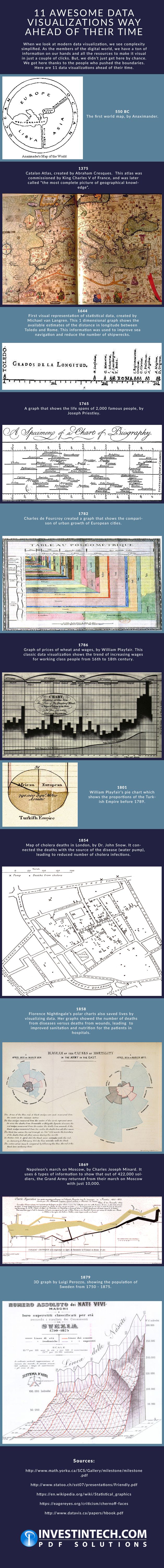
Do you know when the first 3D graph was created? Hint: not in the previous century. You are probably well aware that representing statistical and other data with graphs, charts and infographics is very common today. However, you may be surprised to learn that graphs and charts were not only used centuries ago, but that their usage helped solve really serious problems the humanity was faced with. For example, Florence Nightingale’s polar charts from 1858 saved lives while Dr. John Snow’s map of cholera deaths in 19th century London led to reduced number of cholera infections. The following infographic features 11 awesome data visualizations that were ahead of time when they were created.
Source: investintech

")


 Infographic")


")


![9 Surprising Stats About Entrepreneurs That Will Inspire You [INFOGRAPHIC]](https://i2.wp.com/www.ucollectinfographics.info/wp-content/uploads/2025/10/interesting-stats-about-entrepreneurs_524c41624cd8f-670x1924.jpg?w=100&resize=100,80&ssl=1 "9 Surprising Stats About Entrepreneurs That Will Inspire You [INFOGRAPHIC]")


![Dog Bite Statistics [INFOGRAPHIC]](https://www.ucollectinfographics.info/wp-content/uploads/2025/03/dog-bite-infographic-100x80.png "Dog Bite Statistics [INFOGRAPHIC]")


