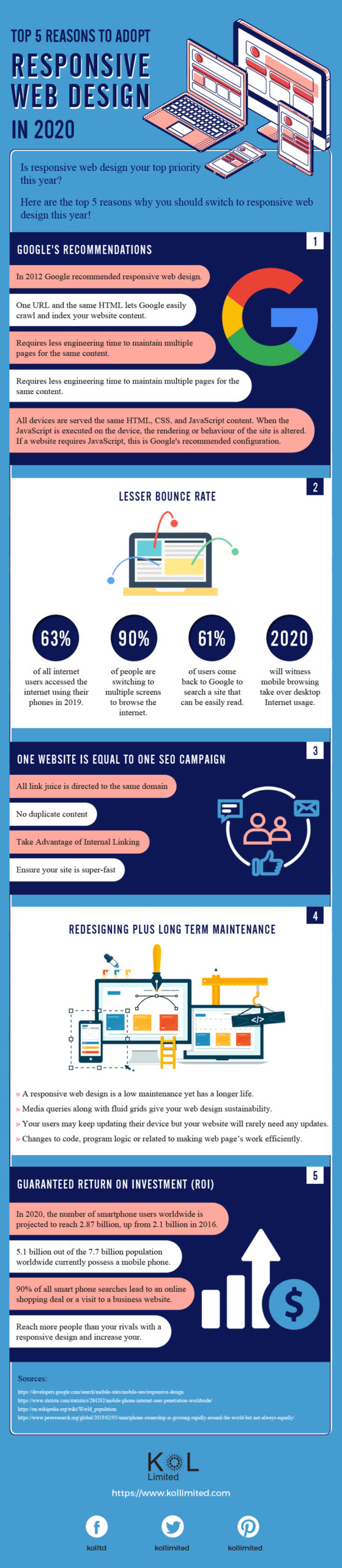
Top 5 Reasons to Adopt Responsive Web Design in 2020
Responsive design allows your website to respond to the device that it is being viewed on. This presents an optimal experience for all users regardless of whether they’re using a phone, tablet, computer or other devices.
Responsive design targets the width of each user’s web browser to determine how much space is available and how it should display the website. Break points are setup to allow us to target ranges that define specific types of displays. For instance, you’ll generally see breakpoints for phones, tablets, and desktops.
Responsive web design creates a system for a single site to react to the size of a user’s device with one URL and one content source. A responsive website design has a fluid and flexible layout which adjusts according to screen size.
The importance of responsive web design is that it offers an optimized browsing experience. Basically, your website will look great and work well on a desktop (or laptop), a tablet, and a mobile phone’s browser. Kol Limited – Best responsive web development company, understands your online marketing requirements.

")


 Infographic")


")


![5 Mind-Blowing Multi-Million Dollar Startup Business Ideas [INFOGRAPHIC]](https://i2.wp.com/www.ucollectinfographics.info/wp-content/uploads/2025/10/NUCLEAR-INFOGRAPHIC-2024-logo-375x1924.jpg?w=100&resize=100,80&ssl=1 "5 Mind-Blowing Multi-Million Dollar Startup Business Ideas [INFOGRAPHIC]")
![9 Surprising Stats About Entrepreneurs That Will Inspire You [INFOGRAPHIC]](https://i2.wp.com/www.ucollectinfographics.info/wp-content/uploads/2025/10/interesting-stats-about-entrepreneurs_524c41624cd8f-670x1924.jpg?w=100&resize=100,80&ssl=1 "9 Surprising Stats About Entrepreneurs That Will Inspire You [INFOGRAPHIC]")


![Dog Bite Statistics [INFOGRAPHIC]](https://www.ucollectinfographics.info/wp-content/uploads/2025/03/dog-bite-infographic-100x80.png "Dog Bite Statistics [INFOGRAPHIC]")


